Schlossfestival
Geschrieben von Pfahli am . Veröffentlicht in Photography, Portfolio, Videography. Schreibe einen Kommentar
Schlossfestival
Photography
About the
SchlossFestival
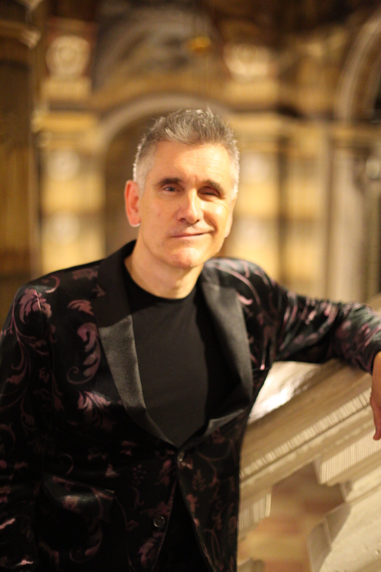
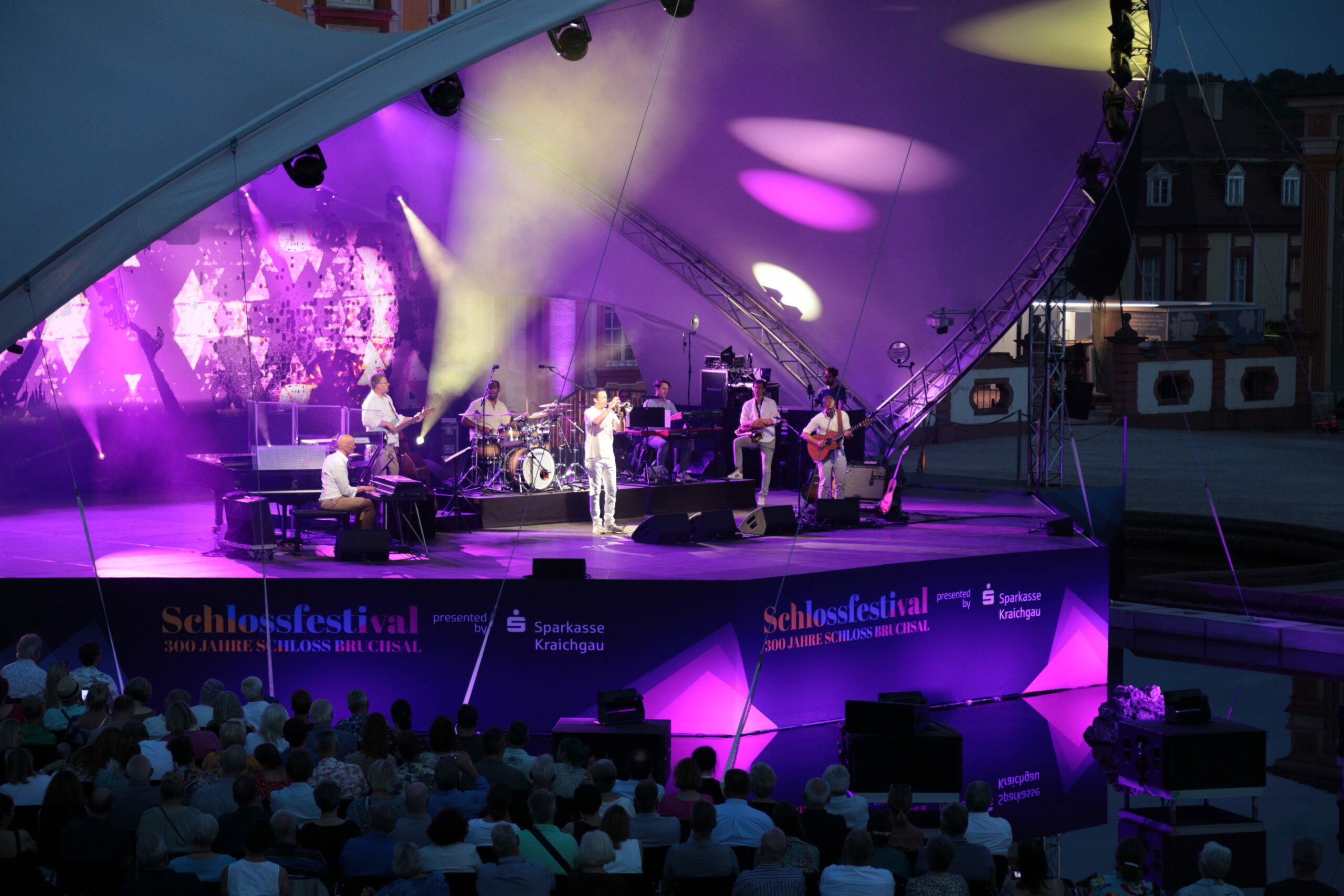
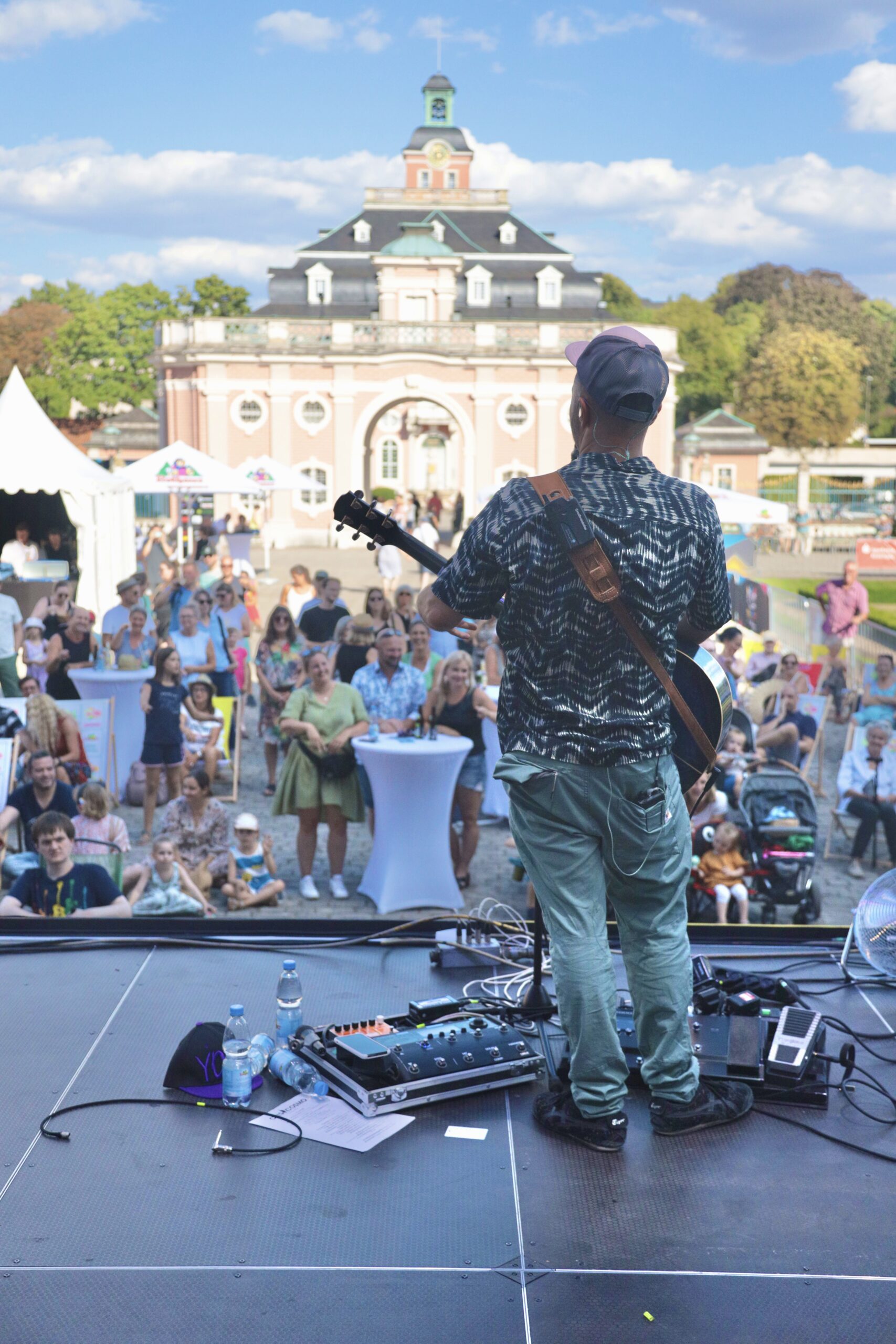
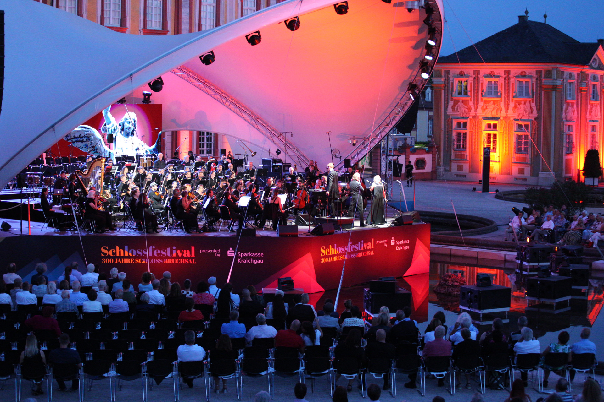
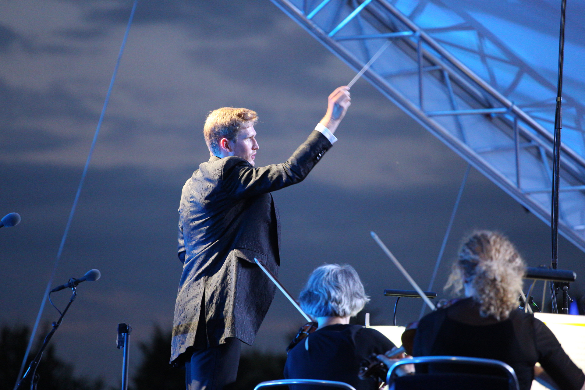
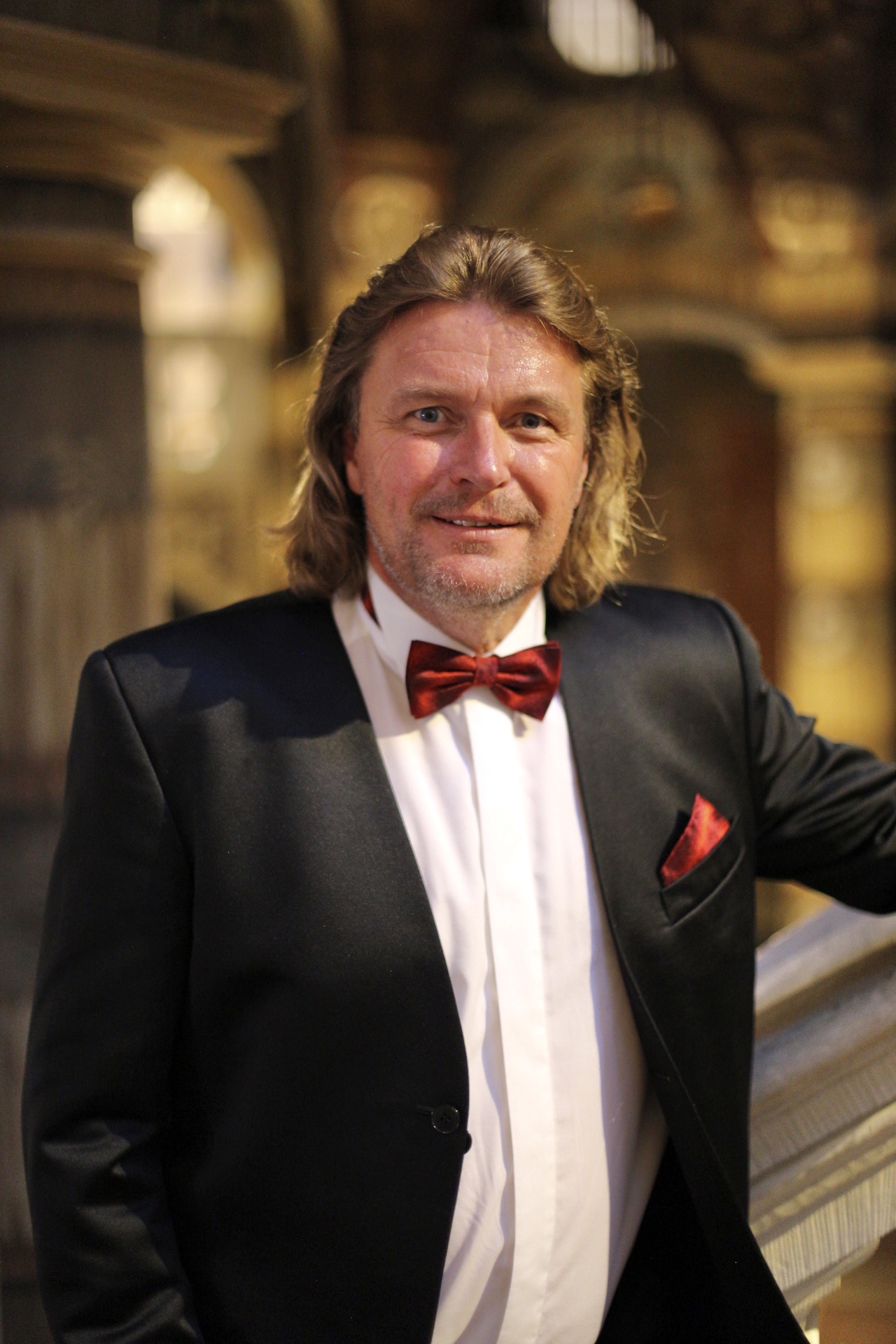
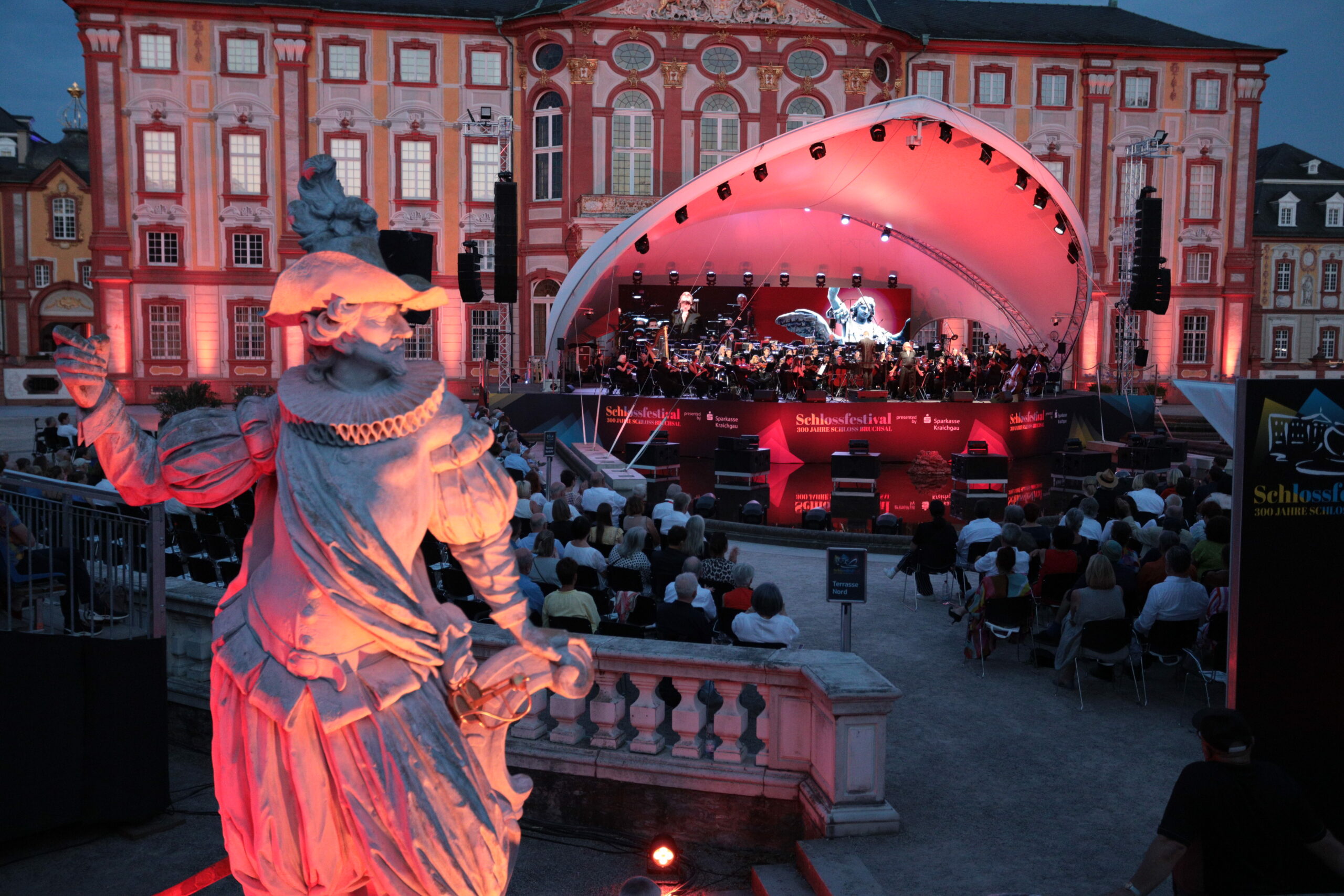
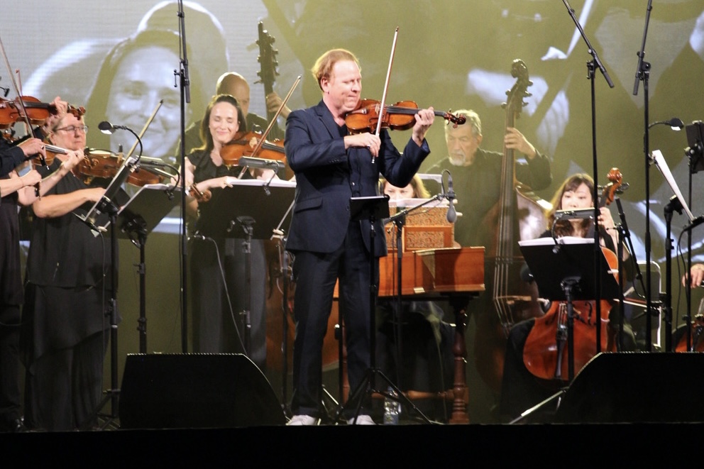
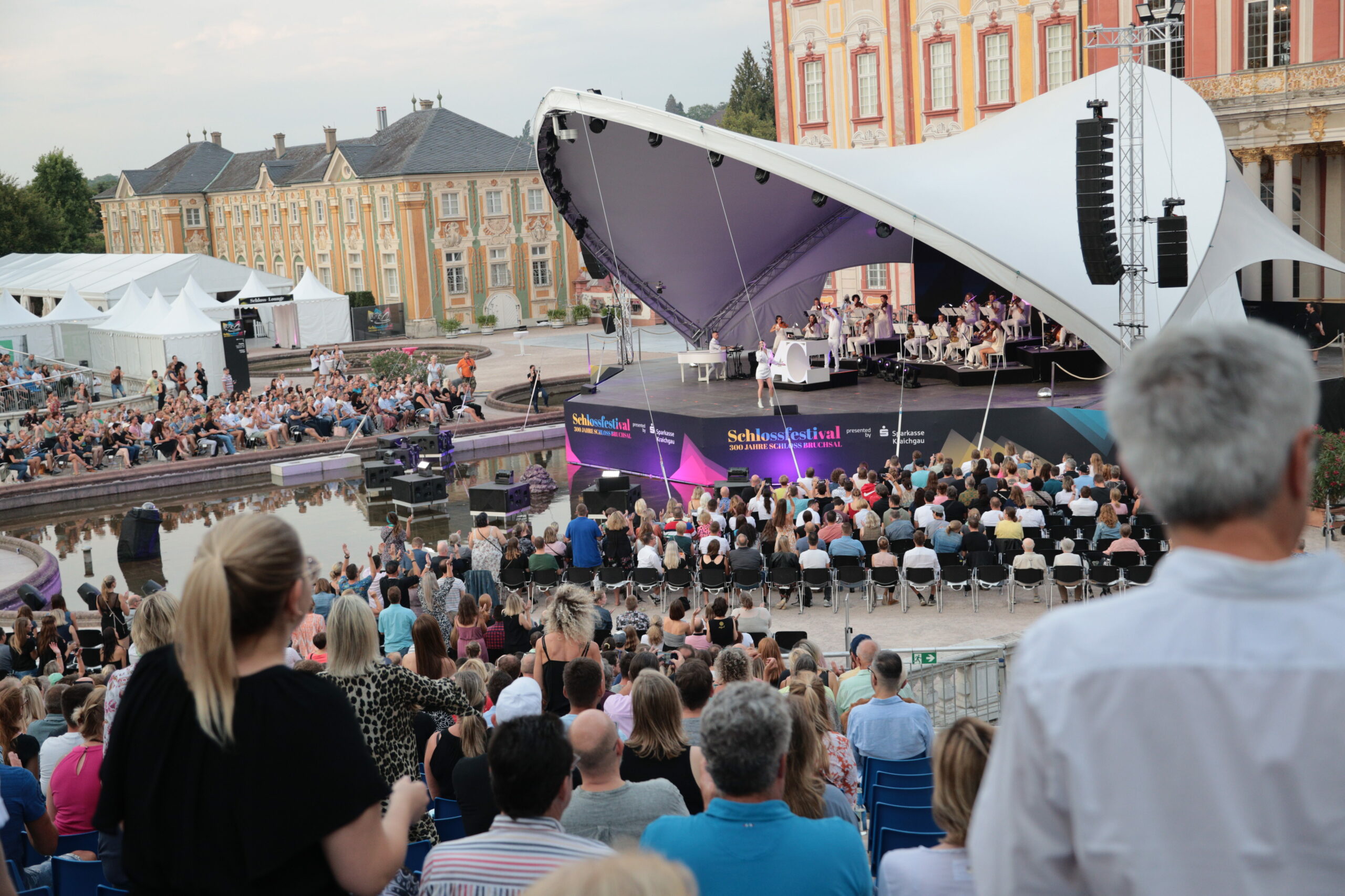
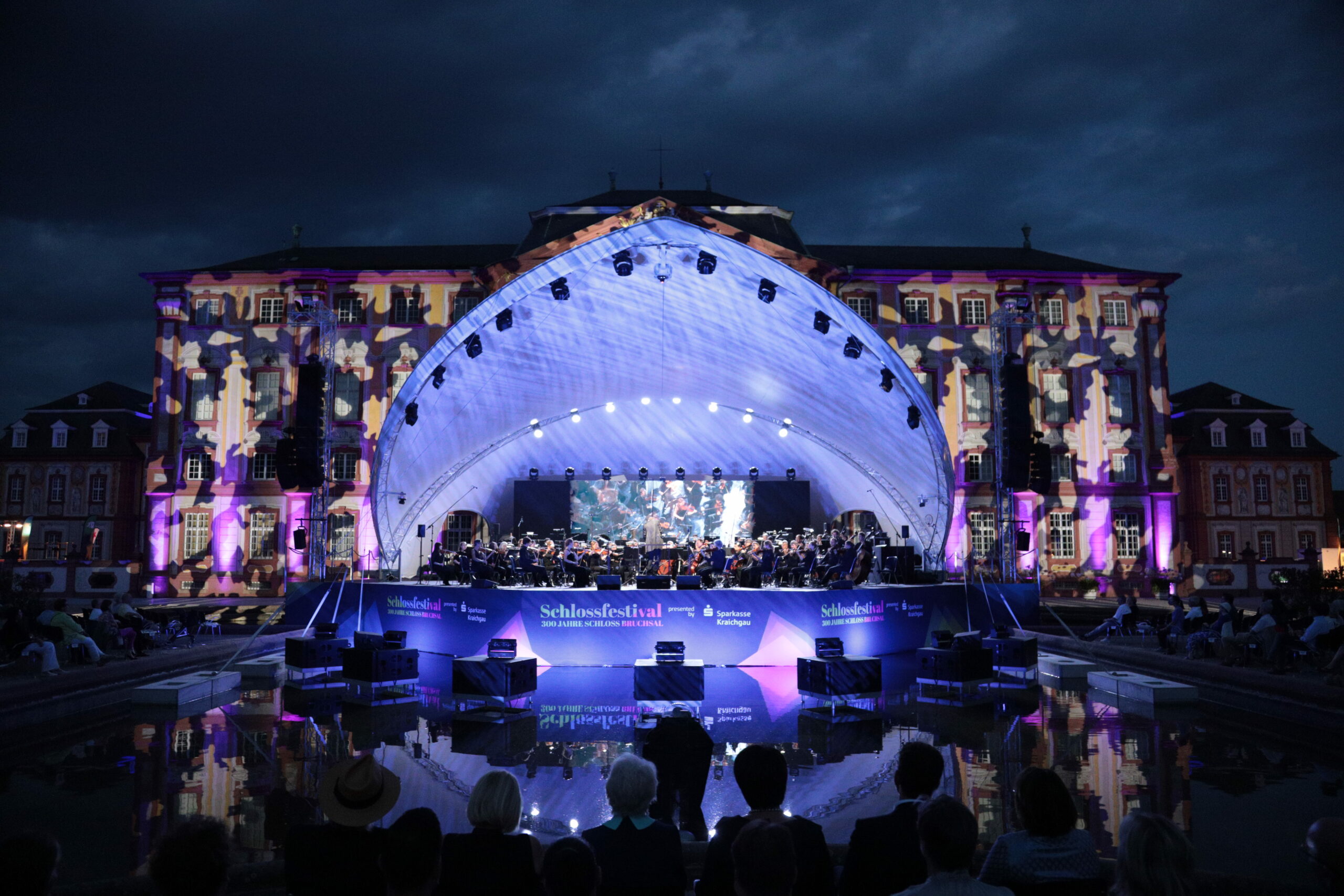
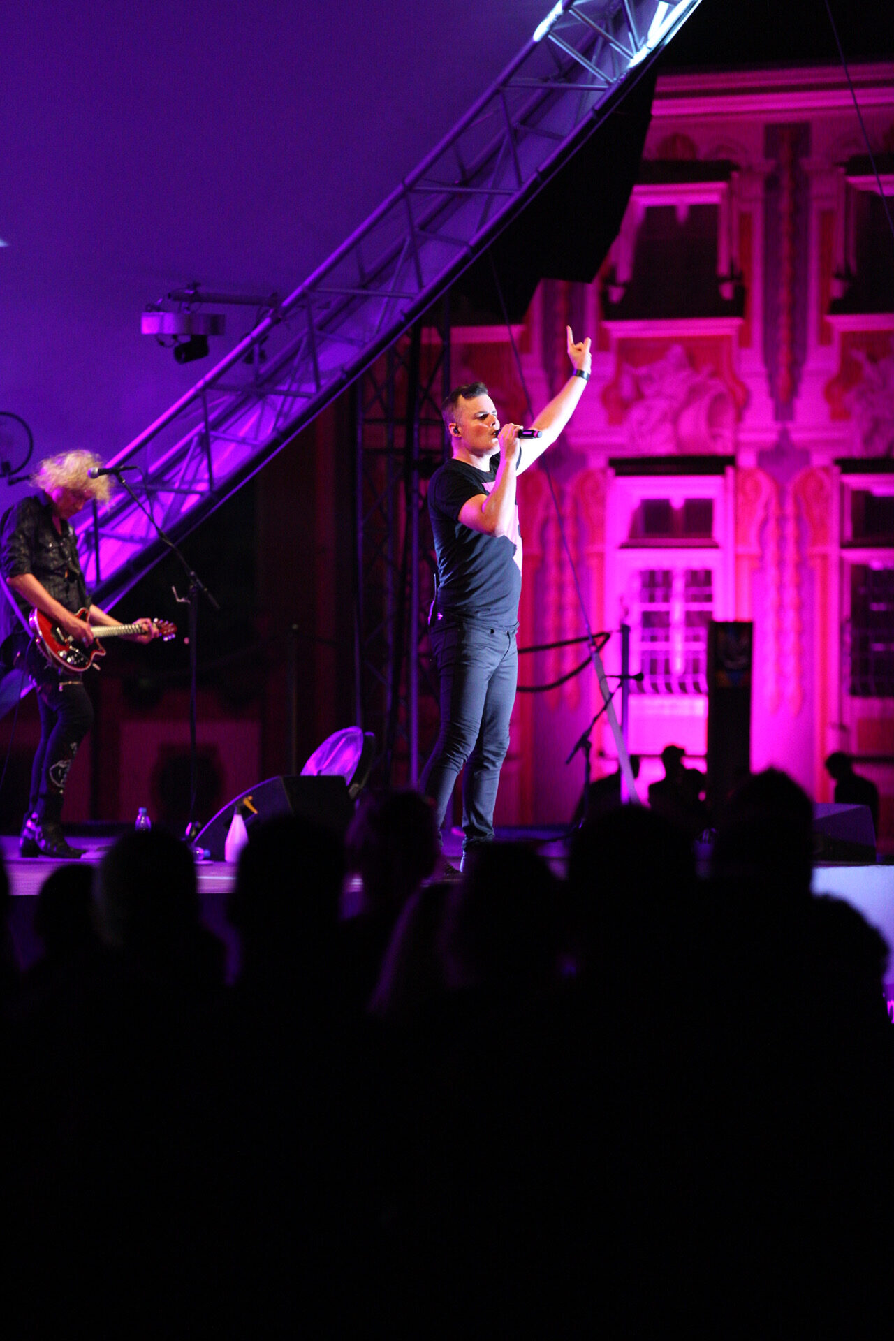
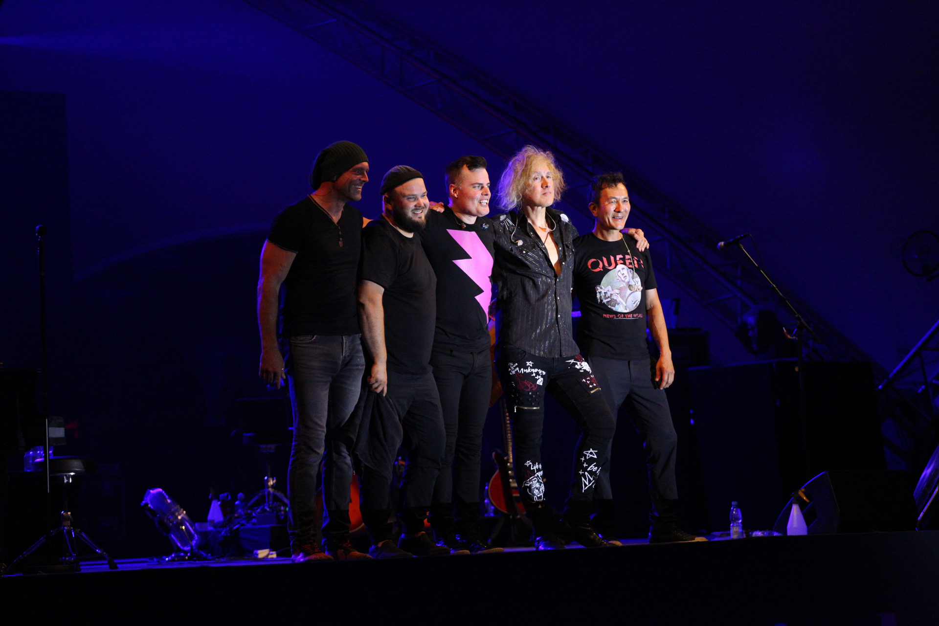
Im Rahmen des 300-jährigen Jubiläums des Bruchsaler Schlosses veranstaltete die Stadt ein Festival mit einer Vielzahl von Künstlern aus den Bereichen Klassik, Jazz, Rock und Techno. Im Laufe von 12 Tagen betreute ich das Festival als Hauptfotograf und lieferte Fotos und Videomaterial von der Veranstaltung an die wichtigsten Nachrichtenagenturen und zur Verwendung in Pressemitteilungen der Stadt und der Künstler.
-

IMG_8532
-

IMG_1648
-

IMG_1628
-
IMG_1735
-
012A6389
-

IMG_1618
-
012A6549
-

IMG_1414
-
IMG_0929
-
IMG_1133
-
IMG_1119
-
012A5424
-

IMG_8774
-
IMG_7555
-
012A9378
Capturing
the Action
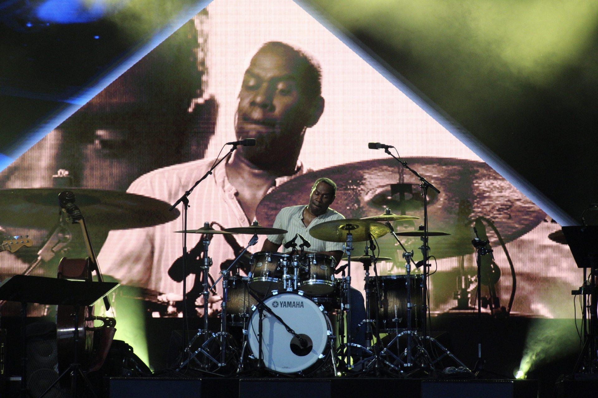
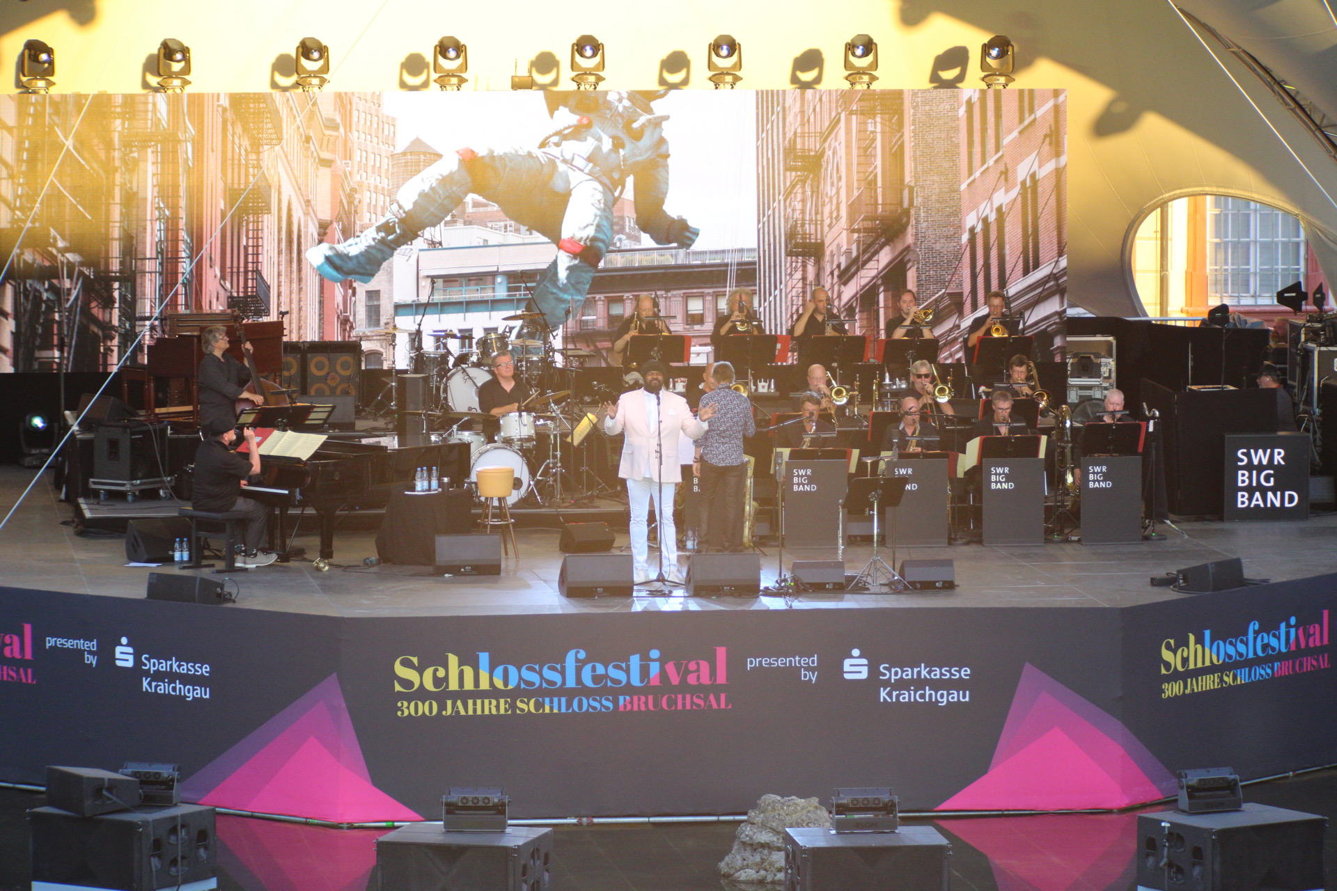
With two separate stages, a backstage area, and a VIP lounge, it was crucial to be in the right place at the right time. As the main photographer, I had the opportunity to take photographs of some of the most prominent acts of the festival, including Marc Martel, Gregory Porter, Alex Christensen, and Curtis Stigers.
-

IMG_7996
-
IMG_1321
-

IMG_9048
-

IMG_9453
-
012A6004
-
IMG_8208
-

IMG_8190
-

012A8306
-

IMG_7555
-
IMG_8751
-
IMG_8839
-

012A9905
Public
Television
AERIAL
PHOTOGRAPHY
dieBauingenieure Imagevideo
Geschrieben von Pfahli am . Veröffentlicht in Portfolio, Videography. Schreibe einen Kommentar
die Bauingenieure
Image-Video
About
dieBauingenieure
Image-
Video
To showcase their work and company to potential clients, I created an visually appealing animated image video for them to use in conventions and presentations. The video was also played at Expo 2020 in Dubai, at the Baden-Württemberg house, to attract potential customers.
Forst hält zusammen Campaign
Geschrieben von Pfahli am . Veröffentlicht in Media Design, Portfolio. Schreibe einen Kommentar
Motoball Open Air Festival
Geschrieben von Pfahli am . Veröffentlicht in Media Design, Portfolio, Web Development. Schreibe einen Kommentar
Motoball Open Air
Marketing & Merchandise
- About Motoball OpenAir
- Logo, Design & Marketing
- Website
- Social Media
- Merchandise
- Promo Smart
- Statistics
About
the Festival
Logo, Design &
Promotion
-
Logo
I designed a new logo that is timeless, versatile, and easy to reproduce. The design was kept simple, making it easy to place in different colors and print on a variety of merchandise.
-
Print
To effectively promote the event across the region, a large number of posters, banners, and flyers were printed and strategically placed or distributed at popular locations.
-
Visualisation
For the posters, I used a silhouette of the Motoball arena to create a direct association between the event location and the event, making it easy for people to recognize and remember.
-
Vivid Colors
Orange was chosen as the main background color for the posters to create an eye-catching design. The orange gradient also resembles a sunset, which adds to the overall atmosphere of the event.


Website
Launch
The website was designed to align with the posters, featuring large pictures and a vintage image noise effect to convey the festival’s character and atmosphere. This helped to create a cohesive image across all promotional materials, making it easy for people to recognize and remember the event.
-
One-Pager
All relevant information about the event can be easily found on the homepage, including the lineup, location, food trucks, partners, and more, making it easy for visitors to plan their visit and find all the information they need in one place.
-
Ticket System
By integrating Eventim, we were able to seamlessly offer customers the ability to purchase tickets in the presale at a discounted price, providing a convenient and hassle-free experience for our visitors.
-
Countdown
A prominent countdown on the website was displayed, which allowed visitors to see how much time was left until the start of the festival, building excitement and anticipation for the event.
-
Image Gallery
After the event, a gallery was added to the website, allowing visitors to download pictures of the event or group photos of themselves, providing a lasting memory of their experience.


Social
Media
As this was the first time the festival was held, it was crucial to spread the word and promote the event on various platforms, to reach as many people as possible. We used different marketing strategies to reach our target audience, such as social media, flyers, posters, and word of mouth, to ensure that the event would be well attended.
-
Instagram
We actively promoted our Instagram channel through a targeted ad campaign and on the channels of our partners, which helped us gain over 350 followers, providing a larger audience for future events and promotions.
-
Facebook
Facebook was an effective platform for promoting the event in local groups and through an ad campaign. Thanks to our efforts, we gained over 140 followers on Facebook, allowing us to reach an even larger audience and keep them informed about future events.
-
WhatsApp
In order to make it as easy as possible for our customers to ask questions about the event, we added a dedicated WhatsApp number. This way, people could reach us quickly and easily with any questions or concerns they had about the festival.
Custom
Merchandise
To give visitors the opportunity to wear some branded merchandise, I printed a wide range of different shirts, caps and bags with the logo in either dark blue or bright orange to fit the styling of the posters.
The logos were cut out of a heat transfer vinyl and applied with a heating press. In total over 250 products have been made this way.


![]()
Promo
Smart
To increase visibility and awareness of the event, we decided to wrap my car in orange and cover it with advertising. We also added weather-proof holders for flyers, so that passersby could take one with them.
The car was parked in different locations around the region and was also showcased at other events, such as games from the Motoball club and other local events. It was also used as a drop box for a raffle, where participants could enter to win tickets for the event.
Metrics
of the campaign
-
> 400
Tickets sold
-
383
Followers on Instagram
-
140
Followers on Facebook
ticker. - Live Studio Production
Geschrieben von Pfahli am . Veröffentlicht in Media Design, Portfolio, Videography. Schreibe einen Kommentar
ticker.
Live Studio Production
About
ticker.
ticker. is a cutting-edge web studio production concept aimed at informing young people about critical issues.
The pilot episode focuses on „Article 13“ of the European Union and examines the various impacts it has on the creative industry.
A Design
to stand out
I was responsible for the visual design of the show. After presenting several options and directions, the team decided to adopt a glitch aesthetic approach. I then refined this aesthetic and incorporated it into all the animations used throughout the show.
-
Logo
The logo for the show was designed to be simple yet effective, with the name of the show prominently featured. To give it a unique touch, I incorporated a wifi-style detail on the „t“ to represent the web show aspect of the production. This subtle nod to the digital nature of the show helped to make the logo immediately recognizable and memorable.
-
Signet
The signet minimizes the logo to the letter ‚t‘ and is used as an overlay element as well as a logo for social media and other formats that require a simpler logo.
-
Glitch Effect
The glitch effect on the logo is achieved by separating it into its base colors (red, green, blue), shifting them and using a negative multiplication effect to create a white center. This technique adds a dynamic and modern feel to the logo, fitting the web show format of the production.
-
Background Glitches
The backgrounds for the show were created using analog TV glitches and distortions similar to those found on a tube television, in order to create a stark contrast with the web-based format of the show.
Green Screen
Keying
Green screen keying is a technique used in video production to superimpose a subject onto a different background. The subject is filmed or photographed in front of a green screen, and the green background is then replaced with a different image or video in post-production. This can be used to create the illusion of a subject being in a different location or to add special effects to a scene.
In our case, we used this technique to create a humorous video about a man representing the Internet, who lives in the void and shares his perspective on the topic with the studio guest. I was responsible for the keying and animation of this clip, ensuring that the final product was seamless and visually appealing.
Motion
Graphics
To explain the concept of Article 13, I created a short explanatory video using animated illustrations. All animations were created using Adobe AfterEffects in conjunction with Adobe Illustrator. We also included a professional voice-over and precisely synced the animations to the audio cues.
Primary
Camera Man
As the primary cameraman for this small live web show, I was responsible for capturing all the action on set. I operated the camera, which had a teleprompter attached, and made sure to frame the shot and focus on the right subject to create visually stunning and engaging footage. I was able to respond quickly and smoothly to requests from the show’s director, moving between different camera angles and positions with ease, ensuring that the final product was polished and professional. My work behind the camera greatly contributed to the success of the show and the positive feedback it received from viewers.
Gemüsehof Schuch - Digital Farmers Market
Geschrieben von Pfahli am . Veröffentlicht in Allgemein, Media Design, Portfolio, Web Development. Schreibe einen Kommentar
Gemüsehof Schuch
Digital Farm Market
About
the Farm
Gemüsehof Schuch is a multi-generational, family-run vegetable farm located in the Palatine region of Germany. They specialize in growing and selling fresh, high-quality vegetables, not only to large supermarket chains, but also to restaurants and individual customers. The farm places a strong emphasis on sustainable and resource-saving growing methods, ensuring that their produce is not only delicious, but also ethically and environmentally responsible.
A modern
logo
Farm market meets
online shop
I was hired to develop a new online shop for Gemüsehof Schuch, which would enable them to sell their fresh produce directly to individuals. The online shop allows customers to place orders online and pick up their purchases directly at the farm, saving valuable time for the employees who no longer have to maintain a dedicated store on the farm. This new online shop is a great addition to their business model and it allows them to reach more customers and expand their business.
-
WooCommerce
I utilized WordPress and WooCommerce to create a robust solution for both the online shop and content management for Gemüsehof Schuch.
-
Deposit System
To reduce waste and save on packaging, we integrated a deposit system for small crates that customers can use to transport their purchases. When customers place their next order, they can return the crates and receive their deposit back.
-
Custom Mails
I implemented customized emails that provide customers with all the necessary information, including pickup times and location.
-
PayPal Connection
To make the payment process more convenient for customers and reduce the need for handling cash on-site, I integrated PayPal as a payment platform.


Social
Media
To promote the shop and give customers a glimpse into the daily life of the farm, we set up Instagram and Facebook channels. These channels allow the farm to share pictures and videos of their products, their farm, and the process of growing vegetables. This also creates a more personal connection with the customers and helps to increase their brand awareness.
-
300
Followers on Instagram
-
140
Followers on Facebook
Promotional
Flyer
A flyer is a great resource for households in the region to learn about the farm’s online shop and how to easily place an order for fresh, locally sourced produce.
One of the most interesting aspect of this flyer is that it’s printed on 100% recycled paper, showcasing the farm’s commitment to sustainability and environmental responsibility. The farm is not only focused on providing high-quality vegetables but also on doing it in an ethical and sustainable way.

FC Germania Forst Relaunch
Geschrieben von Pfahli am . Veröffentlicht in Media Design, Portfolio, Web Development. Schreibe einen Kommentar
FC Forst
Club Website Relaunch
About
the Club
A new design
for a new website
I made it my personal mission to create a new club image that can hold its own against even the largest clubs from the first and second leagues.
-
New Design
The new fonts, clearer color guidelines, and subtle changes to the logo are elevating the club’s design to new heights.
-
Dynamic Content
All content is dynamically sourced from various places and categorizes to minimize the need for redundant content management.
-
Large Images
The use of large, high-quality images enhances visual appeal and helps to grab the attention of visitors.
-
Simplified Menus
To improve usability, the menus have been streamlined to give visitors faster access to the content they are looking for.


Responsive
Design
For soccer clubs, it’s essential to be easily accessible on the go, as fans want to stay up-to-date with the latest results, read articles and learn more about the team. A significant focus of the changes in user experience was to optimize the interface for seamless adaptation between different screen sizes.
-
Adaptive Grid
All posts are displayed in a grid that is easily adaptable to different screen sizes by adjusting the number of columns.
-
Large Buttons
All buttons are large and easy to press with a finger, as well as clearly labeled with their intended function.
-
Filters
To reduce the need for scrolling through a large number of posts, filters were introduced that allow users to easily sort through the most important categories.
-
Space for Sponsors
A significant portion of the club’s income comes from sponsors, so it was essential to provide better visibility for their logos and ads on the website, while still keeping the main focus on the content.
Dynamic
Game results
Manually maintaining match results, league tables, and statistics for each team would be a monumental task for the volunteer members of the club. To alleviate this burden, I utilized an API from a regional soccer platform to load all important content dynamically and in real-time .
This allows visitors to access the latest match, a schedule of all past and future matches, league tables, and player statistics such as goals scored, red cards, and additional information.

Germanen
Cloud
Another crucial aspect of the relaunch was the integration of a locally hosted Nextcloud into the club’s operations. This enables active members to create and share documents, access their email, and manage calendars.
Additionally, the Nextcloud is connected to the CMS via oAuth 2.0, providing cross-platform access with a single account and a streamlined user management.
Metrics
after Launch
-
82.6%
More Visitors*
-
2:43s
Average Session Duration*
-
3.4
Pageviews/Session*
-
92%
SEO Score**
-
100%
Best Practices**
-
92%
Accessibility**
* In the first three months, compared to the previous website in the last three months (Bots excluded)
** Google Lighthouse Score (Desktop)
- 1
- 2